Showing posts with label Presentational Devices. Show all posts
Showing posts with label Presentational Devices. Show all posts
Friday, 20 May 2016
Today's work on Presentation
Sources:
http://en.kiosko.net/uk/np/the_times.html and http://www.bbc.co.uk/news/magazine-36130610
P. Both texts use images to engage the reader.
Q. There is a picture of the Briton who died, with his wife.
E. This engages us because it shows he was loved and was a family man. As this is an English newspaper it focuses on the British person who died rather than the ’66 Egyptians.’
Q. The most interesting picture in text two is the arrest warrant.
E. This reinforces the point that he is a criminal and convicted of fraud. Having a real life document is something you don’t see often in news items so it makes it seem very real to the reader.
P. Both texts use diagrams to help us to understand what happened.
Q. The Irish map tells us exactly where it happened.
E. By giving us this extra detail we can comprehend the situation even more. If someone isn’t familiar with Ireland they can see exactly where it occurred.
Q. The main diagram of the first article shows stage by stage what was happening to the plane with little annotations to explain what is happening.
E. The reader can easily see in a pictorial format what happened. This also engages us because it is not in a text format and it is exciting to see its descent.
Sources: http://www.bbc.co.uk/news/magazine-36097300 and http://www.bbc.co.uk/news/uk-england-somerset-36279782
P. One presentational feature both writers use is a bold title or headline.
Q. The article about the divers catches our attention because it suggests a rescue mission in a ‘cave,’ which seems exciting.
E. By leaving us with lots of questions the headline makes us want to read on to find out what happened.
Q. ‘Bath WW2 bomb scare’
E. This headline gives us a lot more information. The use of the colon also allows the headline to give extra information: ‘hundreds of homes evacuated.’ The WW2 bomb is something unusual and so we are interested to know what happened, also the alliteration of ‘hundreds of homes’ is both shocking and makes you want to know more.
P. Another presentational feature that both texts use is images with captions.

Thursday, 25 February 2016
Presentational Devices
The advert on page 11 effectively uses colour. The colour scheme of the advert is red and two tones of blue. This is because the logo of TBG Learning also uses these colours. It is effective because it is subliminally reminding us about the company the whole time we are looking at the page.
In contrast, the advert on the backpage is multi-coloured which draws the reader’s attention to it. The orange, pink and green helps the advert stand out and is very striking. This makes you want to read the advert and take notice of it.
Even more striking is the picture in this advert….
Friday, 23 October 2015
Tackling Q4 - Nov 2012 - English Language Paper AQA
Point – Both of these sources use the presentational device of pictures. However, they use them in different ways.
Quote – In source two the picture shows two boats, the one they are rescuing and the lifeboat. The rope indicates that the lifeboat is helping the other one.
Explanation – This picture gives the impression of action and also the surroundings of Loch Ness.
Quote – The pictures in source 3 looks like an exotic holiday and shows three men laying down reading.
Explanation – In contrast, the pictures in source three show a much more laid back and relaxed atmosphere.
Point – The presentational device of colour is used in both extracts.
Quote – The over riding colour of the background of source 3’s pictures and source 2 is blue.
Explanation – The reason for the presentation being blue is because both texts are about water and our connotation with the colour blue reflects this.
Wednesday, 8 July 2015

Thursday, 12 March 2015
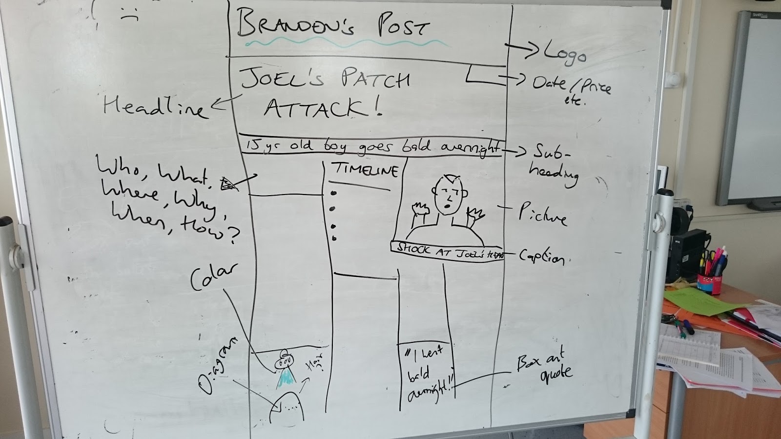
Presentation and Creative Writing Tasks
Magazine / Newspaper Article
· Title
· Logo – this must be the last thing you do!!
· Pictures – Ditto
· Sub-heading
· Caption
· 1st paragraph – who what where when why how
· Newspaper is more formal in tone to magazine
· Pull out quote
· Graph etc – but again not that important
Website Article
· Title
· Logo – this must be the last thing you do!!
· Pictures – Ditto
· Sub-heading
· Caption
· 1st paragraph – who what where when why how
· Hyperlink
· Pull out quote
· Graph etc – but again not that important
Letter
· Address / date at top
· Salutation – “Dear Sir / Madam” or “To whom it may concern” or “Dear Anne Guyman”
· Ending – If you’ve named the person = yours sincerely. If you’ve not named them = Yours faithfully / With very best wishes etc.
· 1st Person – “My first point is…”
Speech
· Speech marks at the very beginning and end
· Salutation – “Hello, I’m Boris Johnson and I want to talk to you about fish.”
· Ending – “Thank you for listening.”
· 1st Person – “My first point is…”
· If you use a rhetorical question you can then answer it.
· Speeches give good structure – “My first point,” “In conclusion…” etc
Script – Radio
· 3rd person
· Naturalistic dialogue
· Dialogue is shown by…
· Radio host: Hello and welcome to Radio Jackie!
Guest: Thanks a lot Brian…
· Describe the action.
Radio Host: Here we are at the start of the London Marathon.
(Sound of gunshot and cheering. )
Radio Host: Oh, and they’re off.
· Emotion. Radio Host: (Angrily) I cannot believe you just said that!
Leaflet
· 3rd Person
· Bulletpoints
· Title
· Sections
· Pictures / Logo
· Information based
· Boxes / graphs
Thursday, 12 February 2015
Presentational Devices
We looked at this article and compared it to yesterday's http://www.bbc.co.uk/news/uk-england-london-31428072
We did a step by step in just the same way as yesterday, but we looked at presentational devices. In this question you need to compare and contrast.
One presentational feature that both texts used for effect are pictures. In the first article we see Liverpool stadium, it is a shot from behind a commentary table. In the second article we see the two leading stars of 50 Shades of Grey. The pictures are relevant to the text as they show us what the article is going to be about, and give you visual information about the subject. By seeing the behind the scenes shot, it is appropriate to the article as it’s all about sport on TV and how much it costs. The film is central to the LFB’s concerns and so it is appropriate, but ironically by using a promotional picture from the film, the article also promotes 50 Shades of Grey.
In contrast, article one uses graphs and tables to display its information, while in comparison article two uses bullet points to do the same job. The bar graph clearly shows how money spent has increased over the years. The bullet points are separated from the article, and while the give extra information, they are not crucial to understanding the article. I prefer the bar and doughnut graphs as it much more visual and uses colour to make it interesting.
Another use of colour is in how the picture in article 2 is grey. This links appropriately because of the title of the book / film under discussion: grey. The central character is called Christian Grey. Another presentational feature in article one is its use of bold sub headings throughout the text. This technique helps break up the text and allow the reader to see each section clearly. It helps organise the long argument of the technique.
Subscribe to:
Posts (Atom)